


Monday, January 31, 2011
Wednesday, January 19, 2011
Evaluation of Vanilla Hills Poster
EVALUATION
Explain how you used the principles of design in your digital poster. Use specific "descriptive" words in your explanation.
White Space: I’ve distributed white space equally on the poster, which means there is some on the top, the middle, the bottom, and between the texts – in order to make the poster look neat and bright. Despite having attractive colors (like green or yellow), white space is needed so that it emphasizes green and yellow spaces, leading attention to the important parts. Moreover, a suitable amount of white space will reduce the tension of other colors (since my poster consists of bright colors, including green, yellow, and some red/brown), making it easier for people to read it.
Focal Point: I’ve made the title the focal point of my poster, though it comes together with a picture of people smiling while riding a ride, Vanilla Hills logo, a curly-butterfly pattern, and a label of “30% discounted weekend”. The focal point consists of attractive colors, including yellow, green, blue, and a monochromatic scheme of red – which means it easily catches attention. In addition, the focal point doesn’t only stand out because of its colors but also the context: the small logo representing the theme park; the big title telling people what the poster is about; the picture of smiley people evoking people of happy moments at Vanilla Hills; the curly-butterfly referring to the fun twisted rides at the park; the butterflies telling people that Vanilla Hills is a relaxing, peaceful place; and the “30% discounted weekend” is the “main point” why people should spend their weekend at Vanilla Hills.
Fantastic Fonts: I’ve used only 3 fonts for the poster, because otherwise it will look really tangled and messy. The title of the poster has the same font (BoogieWoogieHMKBold) as the logo, because that represents the name of the theme park, making it easy for people to recognize. Another font I used was Poor Richard, kind of curly, fantasy-style, “naughty” and wild – which refers to the twisted rides or a magical place. The last font I used was Brandish, which is round-shaped and slightly horizontally stretched. Brandish makes it real easy to read because it looks somehow simple. For that reason, I used that font for the slogan of the poster: Off the rails with VH! Vow your happiness!
Display Balance: All the texts and pictures are displayed equally across the poster, and I made sure they all come in the Z shape (people read from left to ride then down). There are not too many words, only necessary ones – and they are not big words, yet have strong voice of getting attention. I tried to use limited colors for the poster, so each color is distributed equally across the poster, making the context look harmonious. Last but not least, I put two half-circled lines on the top and at the bottom, because they draw the eyes into the poster.
Simple is nice: I didn’t use a lot of pictures, in fact I took only one picture from the internet and developed it into different pictures (though with the same color scheme and style) using the software I have. Most of the shapes in the poster are squares and circles/round-edges, and there is not much information. Overall, still I think my poster is not simple, because somehow it looks busy to me. However, if you observe clearly, then there is no unwanted information. Anyway, I didn’t put in contact lines like others did, because the instructions didn’t say so. I tried putting them in anyway, and the poster looked far worse.
Color Correctly: Some will think that my poster is really colorful, but it’s not. I only used mostly green and yellow, and there is only a little amount of blue and a monochromatic scheme of red. However, the poster still looks cheerful/colorful because green goes nicely with yellow, making the people who read it have a happy feeling about Vanilla Hills. Yellow is referred to happiness, while green represents the hills at Vanilla Hills – or in other words, the place where there are lots of hills, fresh air, empty space, etc In brief, the colors I used speak for the theme park and are especially attractive to the kids. Since the park is for young families, it is quite important if the kids like the park.
Thursday, January 13, 2011
Monday, January 10, 2011
7 Things To Put On A Leaflet To Publicise Vanilla Hills
 | ||
| Vanilla Hills |
7 THINGS TO PUT ON A LEAFLET TO PUBLICISE VANILLA HILLS
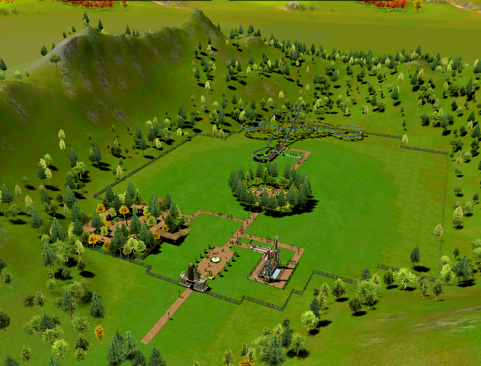
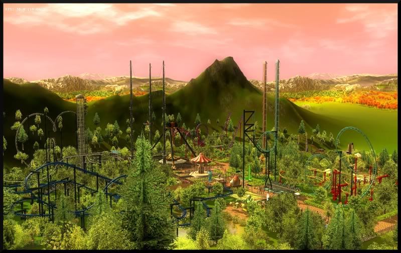 An ideal "destination" for family's holidays, trips, etc
 - because of the geographical features (forest - with fresh clean air and a nice view of the green forest) - far away from the noisy cities - promote family time

Names + pictures of rides/attractions
- and thrilled information about them (how many drops, highness, what's unique about each ride/attraction, etc)
 Dining
 - food and drinks are various to choose, restaurants, dinner/lunch shows, etc

- book tickets/packages, special offers, discounts, membership card (VIP), etc
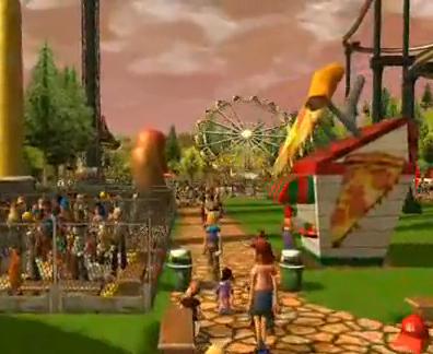
- souvenir shops, 3D cinema, swimming pool, playground for kids/ kids' fun stops, 30% off for Christmas holidays/Children days (for a package of 4+), theaters, competitions to get gifts, fireworks, ATM, health care, Wi-Fi, special meetings with famous celebrities (ex: the president's family) etc


- address, phone numbers, open-close time
Sunday, January 9, 2011
Wednesday, January 5, 2011
My Holiday
My Holiday: December 18th 2010 - Jan 5th 2011 (just for fun)
Holiday's mood: surprised, heart tendering?, 'wow', boring, but meaningful
Even though I got to stay home all holiday, it was truly enjoyable and remarkable. Since I'm a Christian, I had to attend the church before Christmas for Confession, and the priest told me that I had to do something good for people this holiday. I was surprised, because the other years he usually addressed me to pray (not a lot but I'd feel guilty anyway). Anyway, I wondered what I could do, and it all came to me one day when my brother from the U.S. was chatting with my mom and he told her there are several poor families living under Xom Cui bridge (according to an article). The kids their always wished for a Christmas present but never was the wish fulfilled. They also wished to meet Santa Claus - which I think wasn't normal to me, probably because I got to see him since I was younger (just like them). But that I also means I'm more lucky than them. Anyway, my family decided to pay a visit there with presents and cake for them on the Sunday before last Sunday. Seeing their over-happy faces like that made my heart tender, and it was a nice experience for me to play and talk to those kids. Last but not least, I was like, "Wow.." without closing my mouth as it was supposed to be (which means I left my mouth halfway 'till finishing the word, so it was "Wo..") whhen I saw the fireworks on TV on Jan 1st 2011. They were like, ah-ma-zing, especially Australia's firework - colorful, exploding, smoking, outstanding, Wow!
Yeah, it was a great holiday!!!!!

